Google says..Go Mobile by April 21st or Go Home!

As though the month of April is not stressful enough with tax filings, now every business that has a website must focus on making the site mobile search friendly by April 21, 2015. This is the magical date that Google has set to make its algorithms work with the usage patterns associated with a world that is heavy on mobile. According to Google, “this change will affect mobile searches in all languages worldwide and will have a significant impact in our search results.”
If you’re keeping up with the ever-changing landscape of search functionality, you already knew this was coming when Google added “mobile friendly” tags to its mobile search listings last November.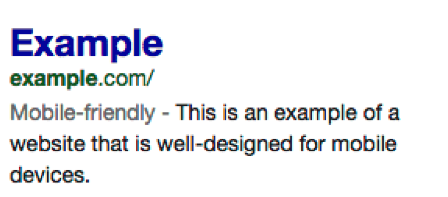
If you didn’t see this coming, then it’s time to ensure your website is ready for Google’s priority on mobile friendly search requirements. So what can you do to get ready?
Mobile Friendly Advice
The first item of business is to determine if your site is mobile search friendly. You can do this by using a Mobile Friendly Test that will run the Googlebot over a few of your webpages. This will give you a high level overview as to whether your site is ready for April 21st or if you have work to do.
If you manage your own website you can get a far more granular view of the mobile usability issues by using the Mobile Usability Report. In order to use this tool you must access your Google Webmaster Tools account to start the assessment process.
Responsive Website Design (RWD) Saves the Day
In the USA, 94% of people with smartphones search for information on their phones. 77% of those searches occur at home or at work, despite the probability that desktop or laptop computers exist at those locations.
A desktop version of your website will be difficult to view on a mobile device. The version that is not mobile friendly will require the user to pinch and zoom the fields they want to view. This makes the overall experience very frustrating and ultimately may drive the visitor away.
A mobile friendly website, driven by the responsive website design, automatically sizes up your website for the mobile experience. No more pinching or zooming the website! Now you have a unified experience for your website visitors, regardless of which device they use.
Thoughts On Making A Website Mobile Friendly…
Streamline the Experience

You would think this goes without saying, but we’ll say it anyway – make the site easy for your customers to use. Everything you do with your mobile content should be done in an effort to make your customers’ lives easier. Here are three steps to start this process:
- Outline the steps your customer takes on your website
- Document the most important and common tasks website visitors take on your site
- Determine how many clicks are requred to complete their objective
Measure the Effectiveness

Supporting the most common and important tasks is vital to keeping your website visitors happy and engaged. The user interface should be consistent and the experience should be unified throughout all platforms. Setting up your metrics will vary by site. Measure what it is they are trying to accomplish, using data before you focus on mobile optimization, and then continue to measure as you make improvements.
Use Responsive Design

Using RWD will help your website become a mobile friendly destination.
Responsive web design or RWD means that the page uses the same URL and the same code whether the user is on a desktop computer, tablet, or mobile phone – only the display adjusts or “responds” according to the screen size.
The RWD creates a unified experience for the user. RWD by itself does not ensure a streamlined experience. You still need to map out the user’s journey in conjunction with designing your site with a RWD.
One big advantage of using RWD is you no longer need to maintain multiple sites, such as a desktop and a mobile site. Using RWD you only need to maintain the one site, focusing on making it the best experience for all users.
Mistakes to Avoid When Going Mobile
Mistake # 1 – Forgetting the Mobile Customer
Creating a mobile friendly site does not mean stripping away all of the functionality in order to make it look good on mobile. Creating a mobile friendly site is one that is optimized to allow the user to complete their tasks and objectives on your site, while using it in a mobile format.
Mistake # 2 – Implementing the mobile site on a different domain, subdomain, or subdirectory from the desktop site.
There is no need to complicate your life with multiple URL’s. Using responsive design simplifies your life, reduces the chances of technical problems and allows you to focus on maintaining one top-notch site.
Mistake # 3 – Working in a bubble
There are a lot of great designs out there to provide you with inspiration for design. Don’t work in a silo! Seek out design best practices and incorporate that inspiration into your mobile optimization.
The Wrap-Up
Google has explicitly stated that starting on April 21, 2015, the change in the search algorithms will significantly impact the search results. Users searching on their mobile device that do not see the “mobile friendly” tag may opt to skip your website all together.
We examined 30 different company websites and found that 19 out of 30 DID NOT pass the Mobile Friendly Test. Does yours?
If you’re not sure, then why risk your business and alienate your website visitors? We don’t want to see that happen to you either, so for a limited time, we are offering a FREE Mobile Friendly and Page Speed Report specifically for your website. The report will educate you on:
1. Whether your website is mobile friendly in its current design format AND
2. If your site currently has mobile ability, the top three action steps to take toward better mobile optimization.
Not ready yet? Want to learn a bit more about us? We love working with people that are discerning!
Fluidity Partners is a Management Consulting and Solutions Agency specializing in our Business Bullseye of Branding, Marketing, Sales and Business Development challenges often faced by small and medium size businesses. Communicating Google’s April 21st mobile friendly deadline was important to us and our clients because many of the sales and marketing solutions that we implement require the incorporation of a well designed website that supports inbound, content and traditional marketing elements. So whether we are integrating an e-commerce platform, implementing a sales and cloud marketing tool or building out a brand portfolio, the web design is one critical component to the entire Business Bullseye.